Logo
Our handwritten logo represents our approachable, caring, and personable nature, while our stylised handwritten cross offers a new and distinctive representation of our Christian heritage.
For the most part, we recommend using the Agapé UK logo. However, when it would be more advantageous for your audience to identify your work based on the sub ministry, use the appropriate sub ministry logo.

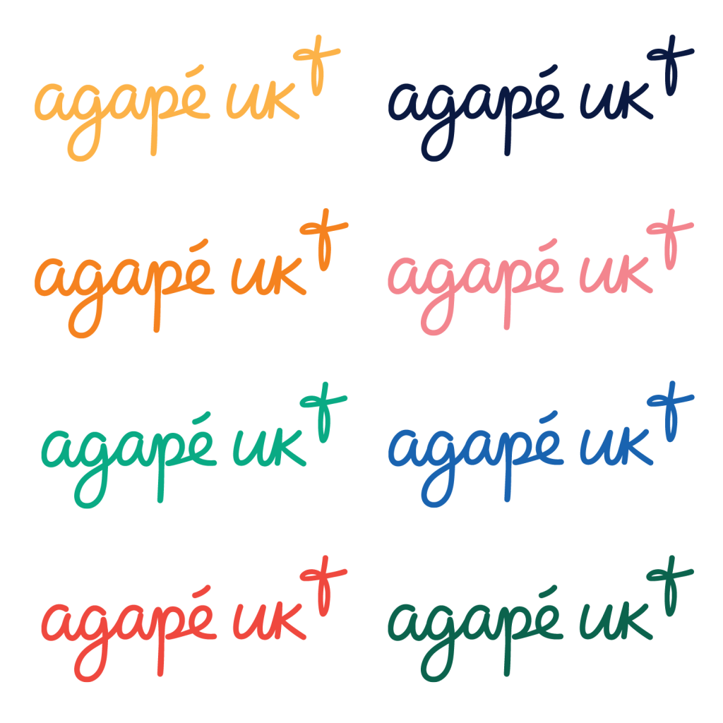
On a white background you can reproduce the logo in any colour from our palette.

The logo should be reproduced in white when placed on a coloured background from our palette.

When placing the logo on top of a photograph, choose the colour from our palette that gives the greatest legibility.

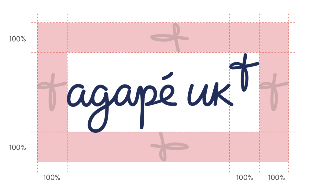
There is a minimum isolation area around the logo that should always remain clear of other graphics or text. This is measured by the size of the cross in the logo.
The minimum sizes for the logos are set at 18mm for print and 100px for digital, to ensure legibility.
Incorrect Use

Colour Format:
CMYK: for printing purposes.
RGB: for digital purposes.
These are different systems, so using CMYK for digital or RGB for print will produce the incorrect colours.
File Types:
EPS: Lossless vector-based file. Will only work with certain programs and applications. The best option if you are printing something large, as no quality is lost by scaling the graphic up.
PNG: Lossless pixel based file. This is what you will want for most situations. Has a transparent background.
JPG: Lossy pixel based file. These files have a white non-transparent background. Only use these files if you need an extremely limited file size. For most situations, the PNG will be a better choice.

